


Mano et Arte
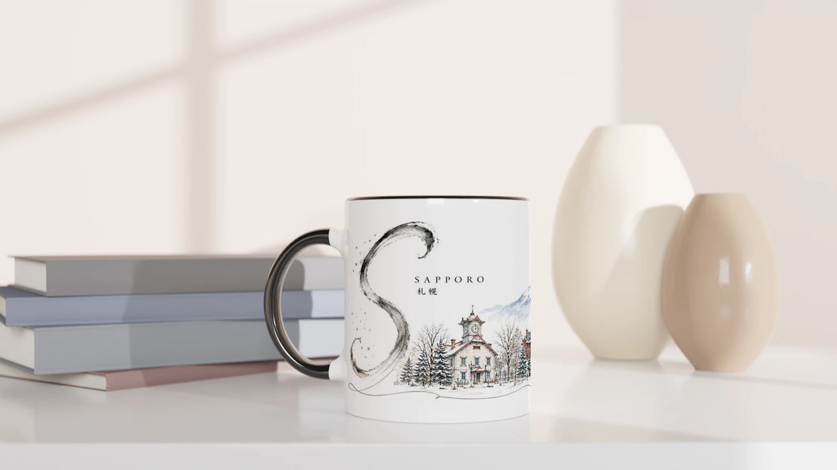
Sapporo Mug 330 ml – Japanese Watercolor with Ink & Winter Landscape
Sapporo Mug 330 ml – Japanese Watercolor with Ink & Winter Landscape
Couldn't load pickup availability
• Sapporo motif from the "Sakura & Steel" series
• Japanese city illustration with watercolor and ink characteristics
• Sapporo between architecture, snow, and mountain landscape
• Fine, freely painted "S" as a design ink element
• Calm color scheme with plenty of conscious white space
• White ceramic mug - Black Edition
• Capacity approx. 330 ml / 11 oz
• High-quality sublimation print
• Dishwasher and microwave safe
• Production upon order
Sapporo — Winter Light Between Ink and City
Sapporo appears more expansive and quieter than many other Japanese metropolises. Snow lies between the houses, clear lines cut through the bright surface, and the Hokkaido landscape already begins on the horizon.
The illustration does not capture a single photographic moment. Rather, it condenses various impressions of the city into a calm, almost sketch-like memory.
Between Architecture and Hokkaido's Expanse
The historic clock tower, striking facades, and the television tower give the motif its urban rhythm. Behind it, the drawing softens: mountains, snow, and sky merge into transparent blue and gray tones.
Precisely this tension makes Sapporo interesting. The city appears modern and constructed, yet at the same time open and almost scenic. Small accents in red and terracotta add warmth to the wintry color palette.
Sakura & Steel
The series tells of Japanese places between two poles. "Sakura" stands for lightness, color, atmosphere, and those open spaces where an image still has room to breathe.
"Steel" stands for architecture, technical forms, city lines, and construction. Both meet without being harshly separated: the organic next to the built, the free gesture next to the clear line.
Sakura
Transparent color, soft transitions, and consciously preserved white space give the illustration its light, atmospheric side.
Steel
Facades, towers, and urban structures bring order, rhythm, and a clear architectural counterpoint to the motif.
The Ink Stroke as a Signature
The large "S" to the left of the cityscape is deliberately not neatly constructed. It looks like a single free brushstroke – slightly transparent, irregular, and with that controlled imperfection reminiscent of Japanese ink painting.
Precisely this creates tranquility. The city can be detailed, the ink stroke remains free. Both keep each other in balance.
A Drawn Memory of Sapporo
For people who appreciate Japan not just as a travel destination, but also as a visual language. Sapporo appears here not as a classic souvenir motif, but as a tranquil place between winter, architecture, and a single free ink stroke.
Produktsicherheit & Herstellerangaben


EU Warranty Notice
Consumers have statutory warranty rights when purchasing goods. The following harmonized EU notice provides information about the essential rights for non-conforming goods.

EU Legal Guarantee Notice
Consumers have statutory warranty rights when purchasing goods. The harmonized EU notice below provides information about the main rights that apply when goods are not in conformity with the contract. Please refer to the official EU notice below for further details.

