


Mano et Arte
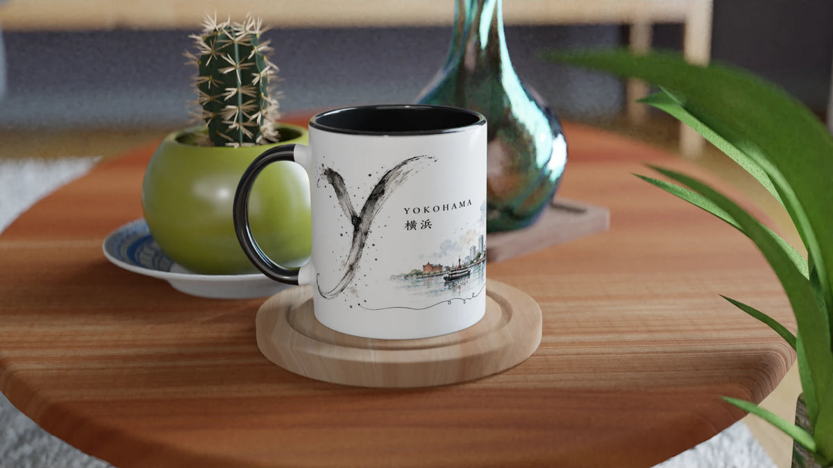
Yokohama Mug 330 ml – Japanese Port City in Watercolor & Ink
Yokohama Mug 330 ml – Japanese Port City in Watercolor & Ink
Couldn't load pickup availability
• Yokohama motif from the "Sakura & Steel" series
• Japanese port city as a delicate watercolor illustration
• Skyline with Landmark Tower and Cosmo Clock 21
• Historic brick architecture by the water
• Large, freely painted ink Y as a design signature
• Serene color palette with ample white space
• White ceramic mug - Black Edition
• Capacity approx. 330 ml / 11 oz
• Dishwasher and microwave safe
• Production upon order
Yokohama — where Japan opens up to the water
Yokohama thrives on the horizon. Water, promenade, and city are not opposites here, but flow into each other. Skyscrapers rise behind the harbor, while their lines and colors are reflected in the calm water.
The illustration captures this special character of the city: urban and vast at the same time, modern yet permeated by traces of its harbor history. A Japanese place that not only grows upwards, but always draws the eye out to the water.
A skyline between glass, steel, and brick
Yokohama's striking silhouette is defined by modern architecture: tall towers, clear facades, and the large Ferris wheel create a precise, almost graphic rhythm in the city view.
In front of it lies a second layer. Historic brick buildings, trees, a waterfront promenade, and small figures bring warmth and scale to the panorama. The city thus appears not monumental, but walkable – like a long stroll by the water with an ever-changing view of the skyline.
Sakura & Steel
In the "Sakura & Steel" series, Japanese places encounter two distinct creative forces. "Sakura" stands for light, color, atmosphere, and those soft transitions in which watercolor unfolds its lightness.
"Steel" is evident in architecture, construction, and urban structure. Yokohama, in particular, bears this contrast very clearly: water and glass, promenade and high-rise, historic facades and modern skyline.
Sakura
Transparent blue, green, and sand tones allow water, sky, and vegetation to gently merge, giving the harbor motif its light side.
Steel
High-rises, the Ferris wheel, and clear facades define the urban rhythm of Yokohama and form a precise counterpoint to the flowing watercolor effect.
The Y as a free ink gesture
To the left of the city, the large "Y" stands like a spontaneously placed brushstroke. It is not geometrically clean, but lively, transparent, and in places rough. The ink seems to move across the paper, rather than forming an ordinary letter.
It is precisely this free stroke that brings calm to the detailed skyline. The architecture remains clear, the ink is allowed to be unpredictable – two different styles that support each other in the motif.
A memory of Japan's great port city
Yokohama appears here not as a classic skyline, but as an encounter of water, architecture, and movement. An illustrated travel memory for people who like to discover Japan through its places, its lines, and its quieter spaces.
Produktsicherheit & Herstellerangaben


EU Warranty Notice
Consumers have statutory warranty rights when purchasing goods. The following harmonized EU notice provides information about the essential rights for non-conforming goods.

EU Legal Guarantee Notice
Consumers have statutory warranty rights when purchasing goods. The harmonized EU notice below provides information about the main rights that apply when goods are not in conformity with the contract. Please refer to the official EU notice below for further details.

